
Sankey Diagrams: A Passing Trend or Here to Stay?
Sankey Diagrams: A Passing Trend or Here to Stay?
In the ever-evolving landscape of data visualization, various tools come and go, but some manage to carve out a lasting place. One such tool that has garnered attention recently is the Sankey diagram. This flow diagram, known for its ability to represent the magnitude of data flows and relationships, raises the question: is the Sankey diagram just a trendy fad, or is it here to stay?
What is a Sankey Diagram?
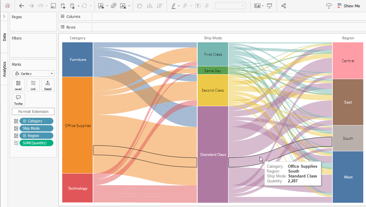
A Sankey diagram is a type of flow chart that visually depicts the flow of resources or information between different entities. The width of the arrows or paths is proportional to the flow quantity, making it an effective tool for illustrating complex processes and relationships.
Why Sankey Diagrams Became Popular
- Clarity in Complexity: Sankey diagrams excel at simplifying complex datasets, particularly those involving multiple flows and interactions. They provide a clear, visual representation of data, making it easier to understand where resources are being allocated and how they move through a system.
- Visual Appeal: The aesthetic nature of Sankey diagrams—clean lines and proportional flow—makes them visually appealing. This appeal has contributed to their popularity in presentations and reports.
- Versatility: These diagrams are used across various industries, from energy management to finance, to track and optimize resource usage. Their versatility adds to their widespread adoption.
The Case for Longevity
- Enhanced Data Interpretation: As data becomes more complex, the need for effective visualization tools grows. Sankey diagrams provide an intuitive way to interpret and communicate these complexities.
- Integration with Data Analytics Tools: Many modern data analytics platforms and tools support Sankey diagrams, making them accessible for data scientists and analysts. This integration ensures their continued relevance.
- Educational Value: In educational contexts, Sankey diagrams are valuable for teaching concepts related to flow and distribution. Their ability to visually represent data makes them a powerful tool for learning.
The Potential for Decline
- Overuse and Misuse: Like any tool, Sankey diagrams can be overused or misused. When applied to unsuitable datasets, they can become confusing rather than clarifying. If this misuse becomes widespread, their credibility may suffer.
- Competition from New Tools: The field of data visualization is rapidly evolving. New tools and methods are constantly being developed, some of which may offer more efficient or effective ways to represent complex data.
- Learning Curve: While powerful, Sankey diagrams can have a steep learning curve for those unfamiliar with their construction and interpretation. This barrier could limit their widespread adoption.
Final Thoughts: Trendy or Timeless?
Sankey diagrams have undoubtedly made a significant impact on the field of data visualization. Their ability to simplify complex data flows and their visual appeal are strong points in their favor. However, their future depends on how well they can adapt to new challenges and continue to provide value in an ever-changing landscape.
For now, it seems Sankey diagrams are more than just a fleeting trend. Their integration into educational curriculums, business processes, and data analytics platforms suggests they have the potential to remain a valuable tool. However, as with any tool, their longevity will depend on their appropriate use and the continuous evolution of their applications.
Stay tuned for more insights into the world of data visualization and data science.