
Brushing off the Tableau Cobwebs.
I am getting back into creating dashboards with Tableau. It's a toolset that I dipped my toes in, made a few projects but never expanded. I'm going to rectify that by making more dashboards for fun. Dashboards can be useful because the audience can manipulate the data in real-time which can lead to insights that can be inspected in more details.
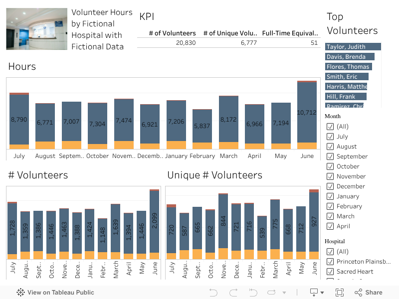
I created this mockup because because there were a lot of tuturials on the Human Resources dashboard and I happened to be watching House, hence the name of one of the hospitals being Princeton Plainsboro Teaching Hospital. I randomized names, hours and locations to generate a dataset. Ideally, you can see which month has the most volunteers. Where volunteers are volunteering at. You can see the relationship between the number of volunteers versus how many are unique. The greater the discrepancy, the more volunteers are doing multiple shifts.
This was an little excercise in knowing that I still got it. I wanted to design it kind of how business KPIs are normally designed.